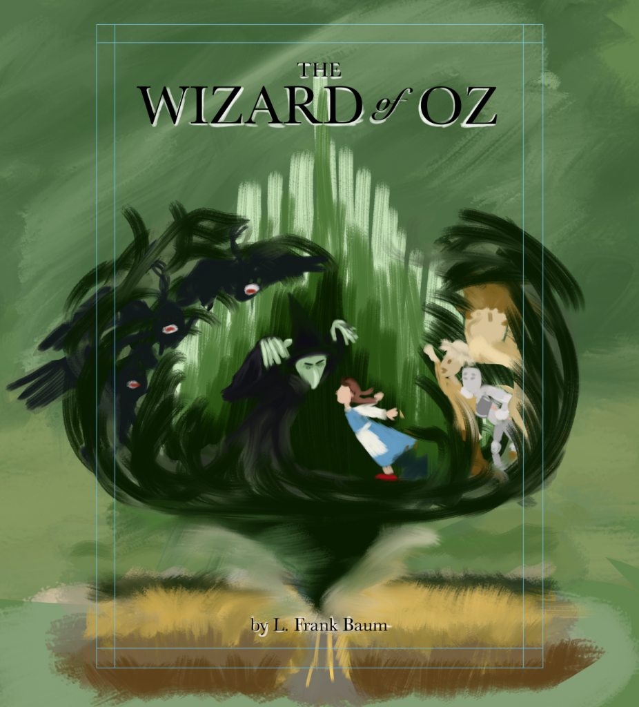
SVSlearn.com’s July challenge is to design a book cover for the Wizard of Oz.
I’ve roughed up the concept and colours. I feel like I have no idea what I’m doing, or how to get it to where I want it to be, but I’m digging in pretending I do…

Can we use the stereotypical references everyone thinks of for Oz? Dorothy in a blue dress? A tin man with a funnel on his head? A green faced witch? Or can we change it up a bit?
The challenge states:
“You have been contacted by an art director and they are wanting YOU to design a new cover of an edition of The Wonderful Wizard of Oz that they will be publishing.
•
You must make it eye-catching and representative of the story. You have creative freedom in style, character design, scenery, and moment.
•
The cover must be 5.4 inches wide x 8 inches tall with a .25 inch bleed.
•
Included is a template that you can use to create on. Feel free to use the title design on the template. Or you can come up with your own title design if you want.”
So, I guess ‘creative freedom’ is anything goes?
Sounds good.
Let’s go!
