Okay, moving on from vehicles for a bit.
Time to play with colour!
I’m working through SVSlearn.com’s class The Magic of Color.
(My Canadian spell checker gets upset with me when I spell color like that…)
This is a happy place for my brain.
Again, the way SVSlearn.com presents their classes are fantastic.
Instead of assuming I have some inherent ability to figure out colours, Will Terry is teaching how people make a game plan for their colours.
YES!
I need to know these things!
I like colours. But I know that there are aspects of using colour that I don’t understand. How do you know if colours match? How do you decide on a theme? How do you choose which colours go where? Just knowing that there are things related to colour that I don’t know and don’t understand has made me hesitant with moving forward and colouring things. Yes, I could just splash some paint on there, but I’d love to get some tips. Sometimes splashing paint on there feels like jumping in a moving car. Knowing some basics could help a whole lot to make the ride more fun and actually get you where you want to go.
I love that, again, I’m told I can learn this. It’s so easy to just say I don’t have a good eye, or talent, or that ability. And give up. But I really want to learn, and this sounds doable!
Tip to tuck away: Warm Colours come forward, Cool colours recede. Shaded (blacker/darker) colours cool, Tinted (lighter/whiter) colours warm. Put the cools in the background, in general. Your eye goes to the warm colour first.
Tip to tuck away: Color Harmony. This video answered so many questions! Like, how do you know if colours go together? Sometimes it just seems like personal choice. For instance, my favourite colour is racing car green. It’s definitely not everyone’s favourite colour. So how do I make colour decisions??? Ha! I want to try working with triadic colours. It sounds like I choose same distance apart of ‘yellow’, ‘blue’, and ‘red’ on the colour wheel. Then I’m free to mix these and tint and shade them. (Which kinda brings up more questions. Can we mix all the colours from three colours. Can’t I get any colour by mixing? What are the limits to this mixing, to keep it aligned with the theme?)
Tip to tuck away: The contrast of boring (muted?) and rich (vibrant?) makes the colours seem more depth/lively.
Tip to tuck away: Highlights use a different colour leaning towards the warm (and shadows towards the cool). Not just a lighter or darker version of the colour.
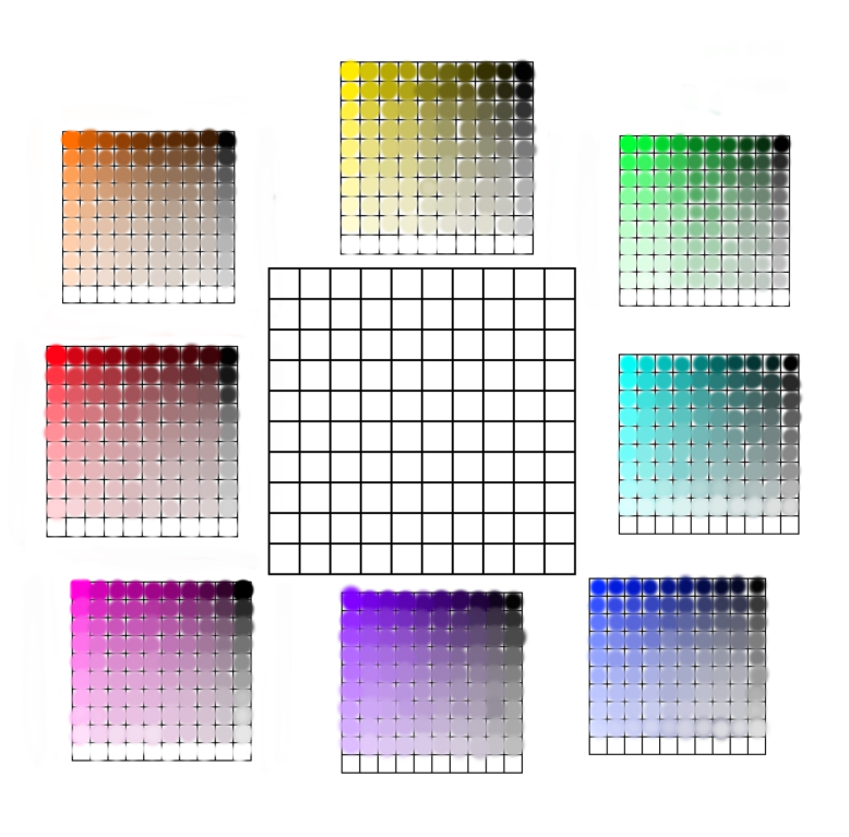
Assignment: Colour Swatch Mixing!
I’ve done this with watercolour before, so I thought I’d try it digitally this time since I’ve been working more in Krita than on paper.
Colour Swatches, One Colour:

Colour Swatches, Two Colours:

Now to do a bunch more!